New site design!
HAY GUYS~
You might notice it looks a little different around here! I’ve been working on a new site design for the last couple weeks, and it’s finally ready, so I flipped the proverbial switch yesterday afternoon. It’s all based on the Easel theme this time around, so I’m totally converted over to Comic Easel from the old ComicPress system now, and I think that’s pretty fantastic.
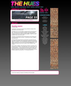
The initial site design was kind of quickly cobbled together when I launched the comic earlier this year, so I’m not sad to see it go. As a point of interest, here’s the initial mockup I made of the new design:
I tweaked and changed some things as I went through customizing the CSS, and the result is before your eyes. :D
The comic pages in the archive were 550 pixels wide before, and now they’re going to be 750 pixels wide, so my nice artwork wont be quite so shrunk down. ;u; The last couple pages are already sized up to the new format, and I’ll be going through the archives and replacing the old comic images with the bigger ones over the next few days.
If you notice anything wonky, let me know! I looked at the site in Chrome, Firefox, and IE and everything looked okay to me, but you never know.
I’m also enabling comments on individual pages for the moment, since the discussion threads haven’t really been working, AND I installed Disqus comments. So. That’s a thing.
Anyways, I hope you all have a great weekend, and I’ll see you on Monday!
